How to Hunt | 2015
Role | UX UI IxD iA
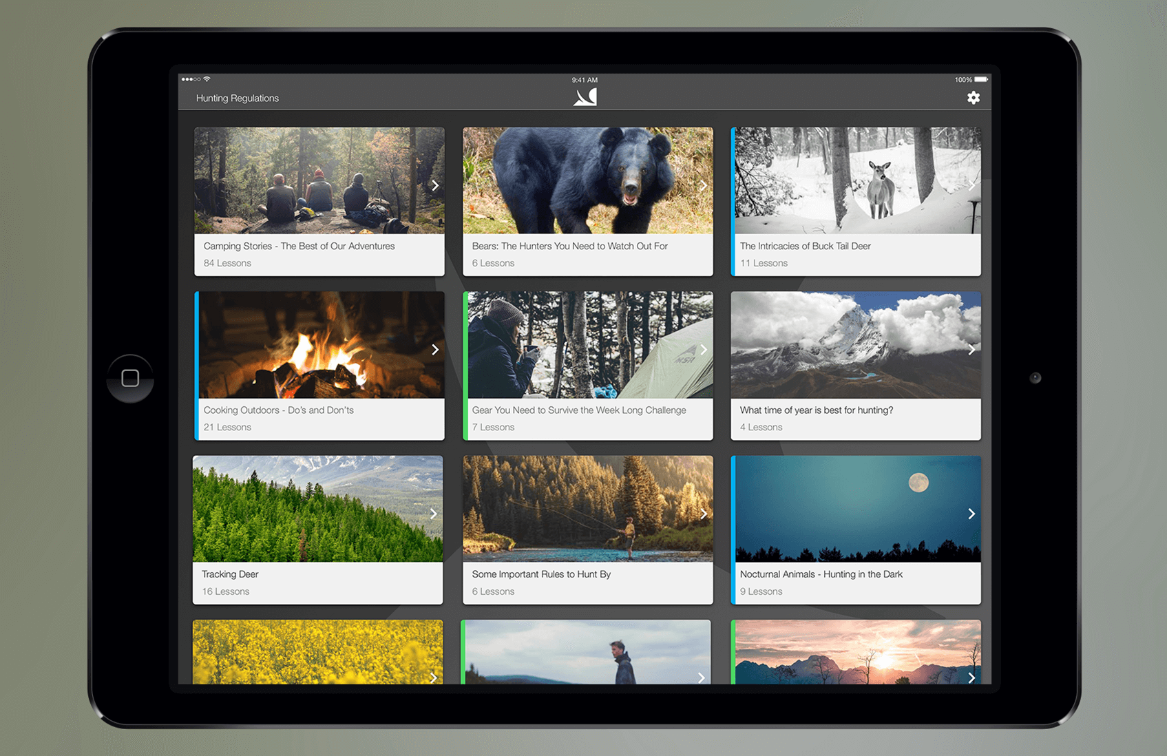
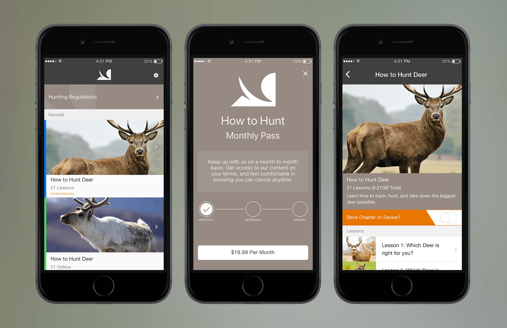
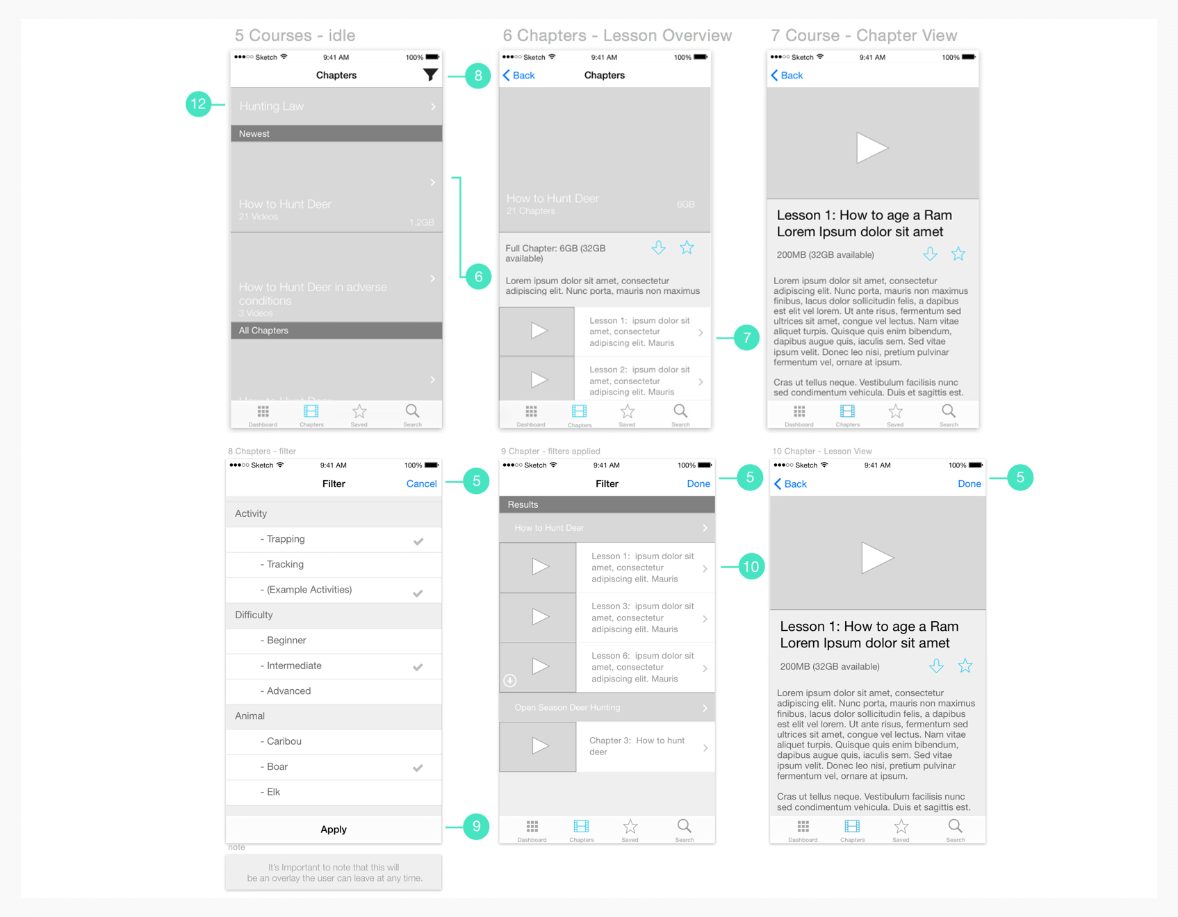
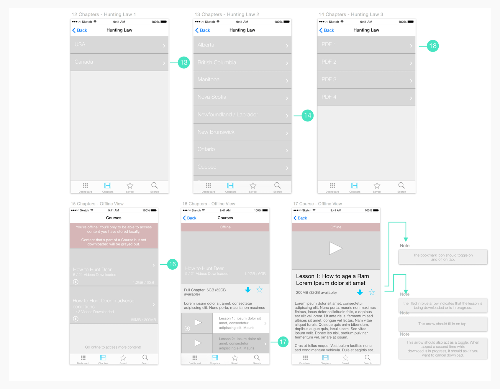
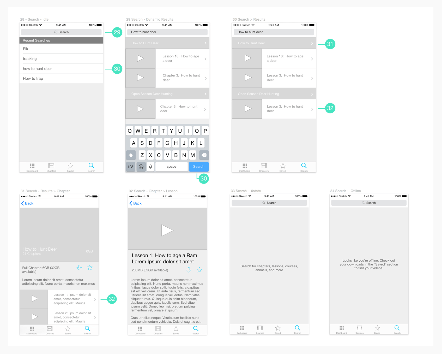
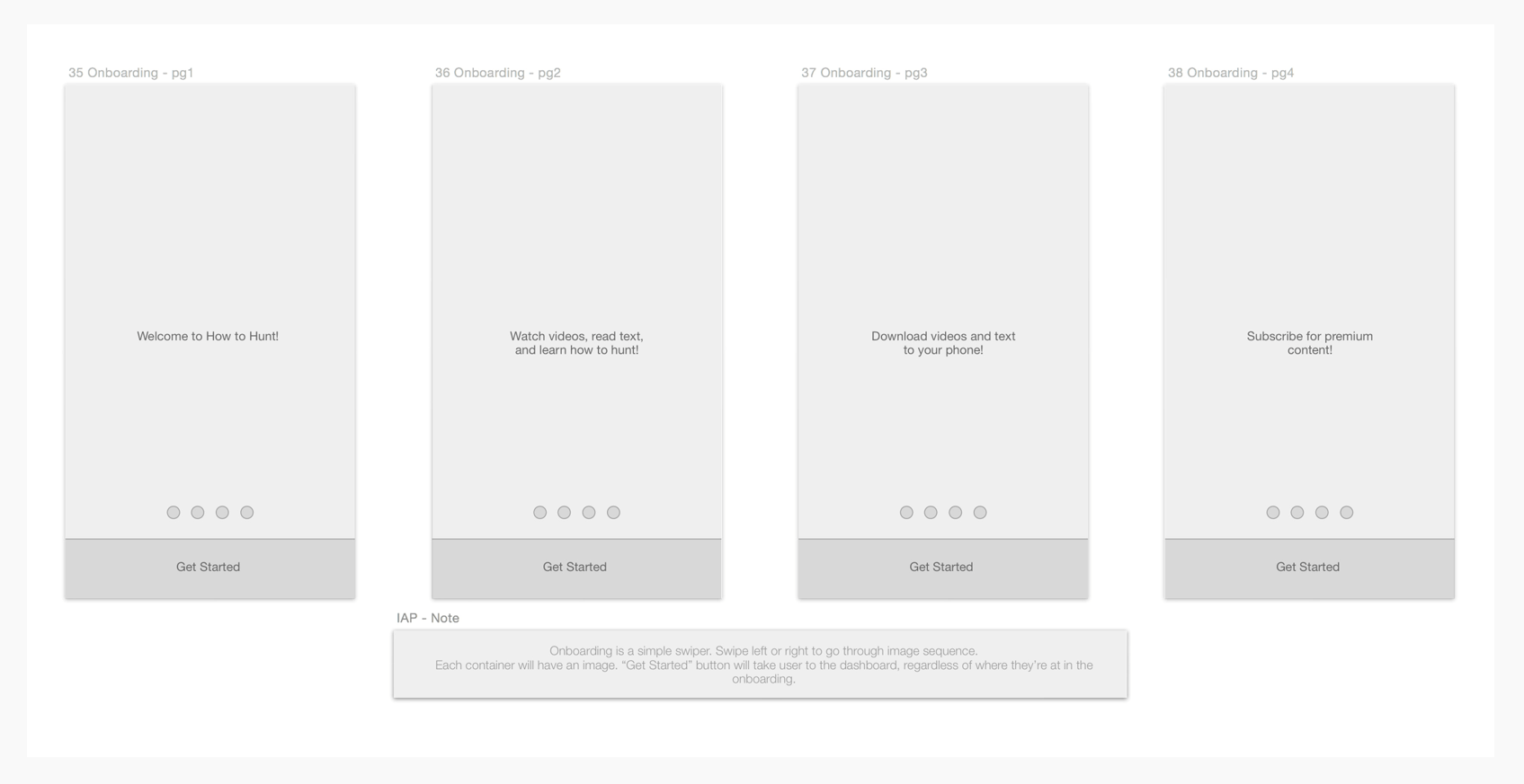
I worked closely with our client to design a distribution channel for their educational material on hunting. This was aimed at both experienced and less experienced members of the hunting community. An important goal was to make content accessible even way out in the wild where there’s no cell service!
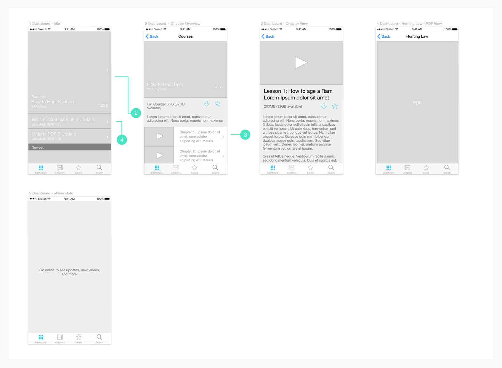
We were tasked to create it quickly and efficiently. The Dynamic Leap team and I chose to identify and execute on key functionality only (for example, instead of a fleshed out admin panel we created a command line UI for pushing content to the app). We also leveraged as many standard components on iOS and Android as possible to try and mitigate speed bumps through development.
Goals
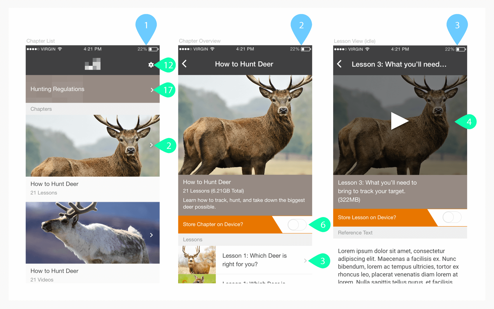
- Design and develop a distribution service for the client's video content, written work, and associated media
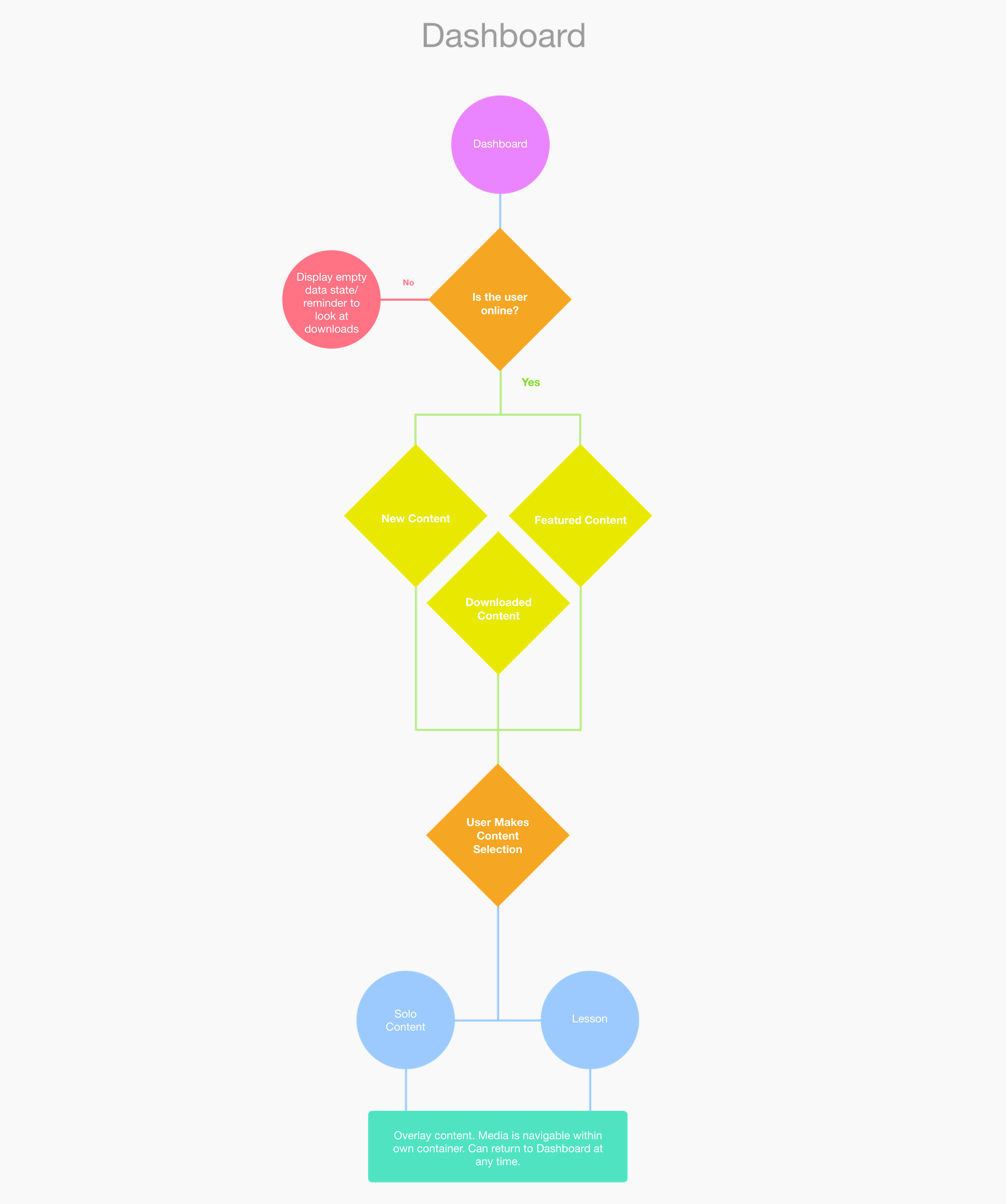
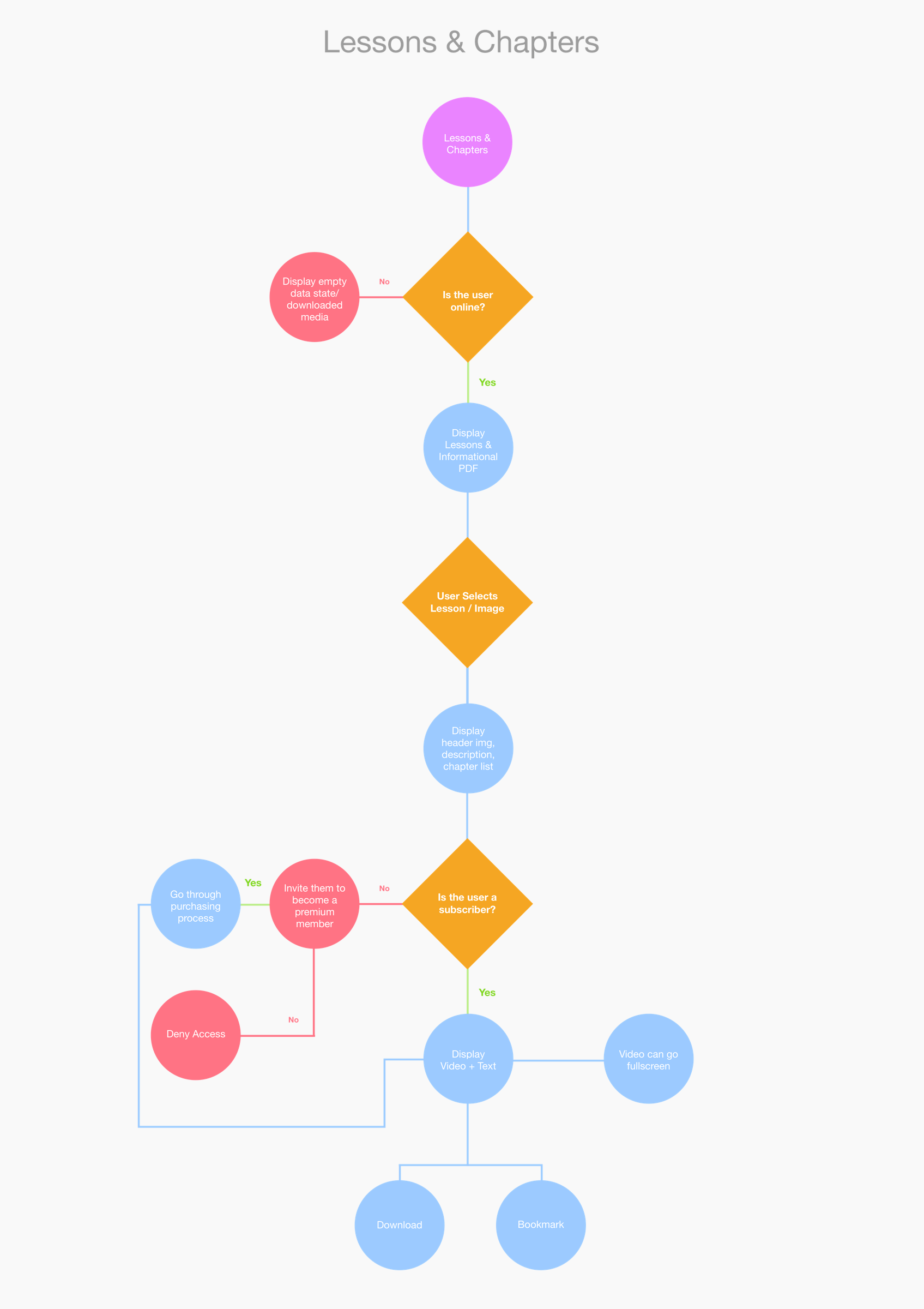
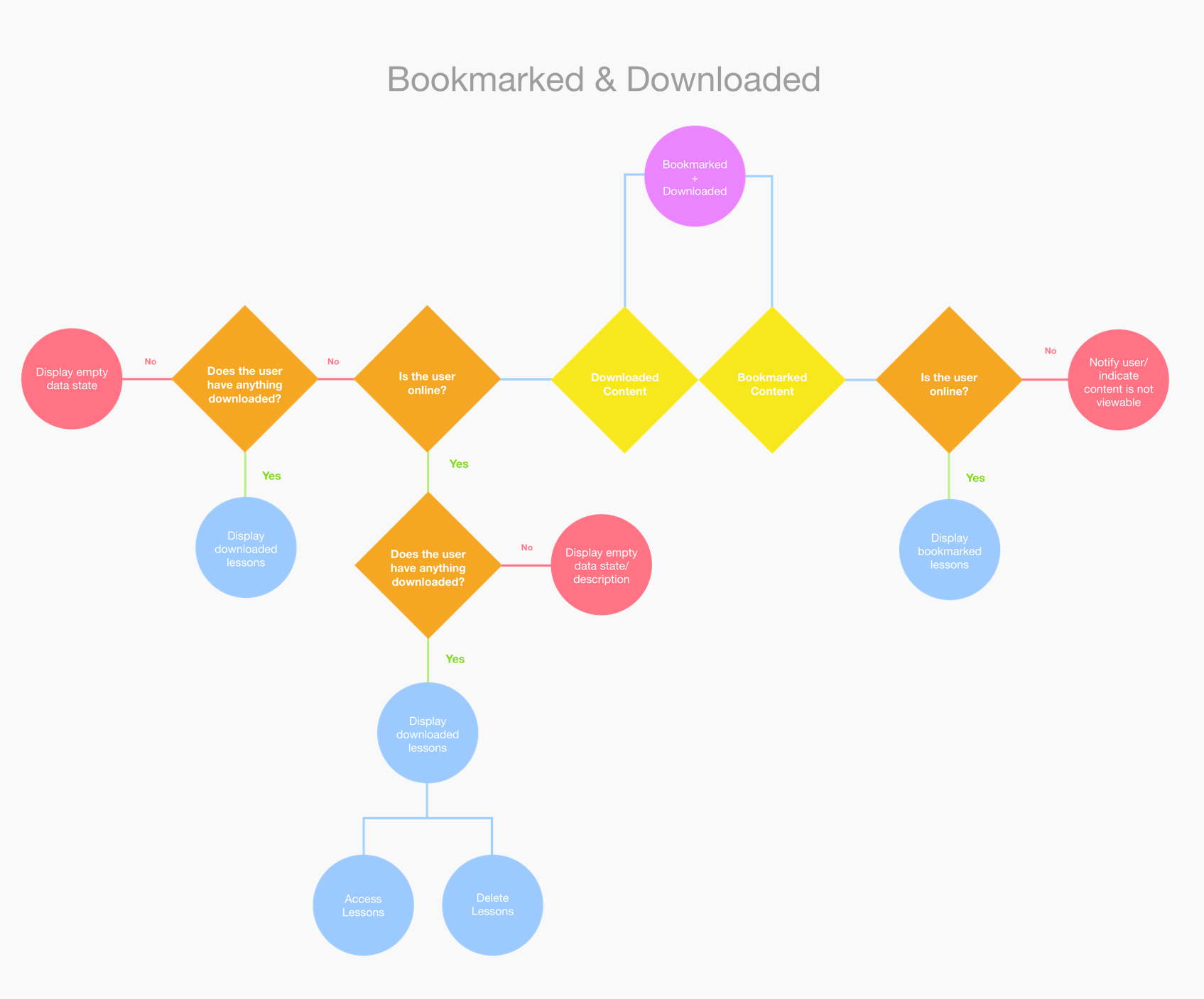
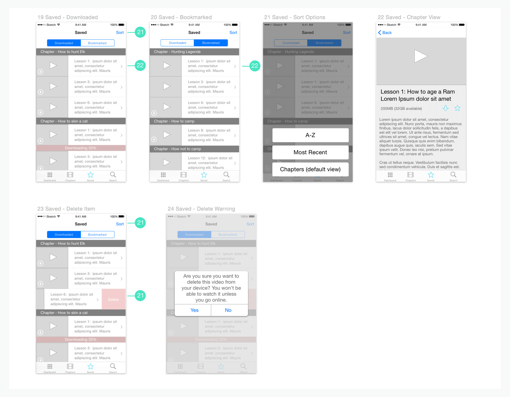
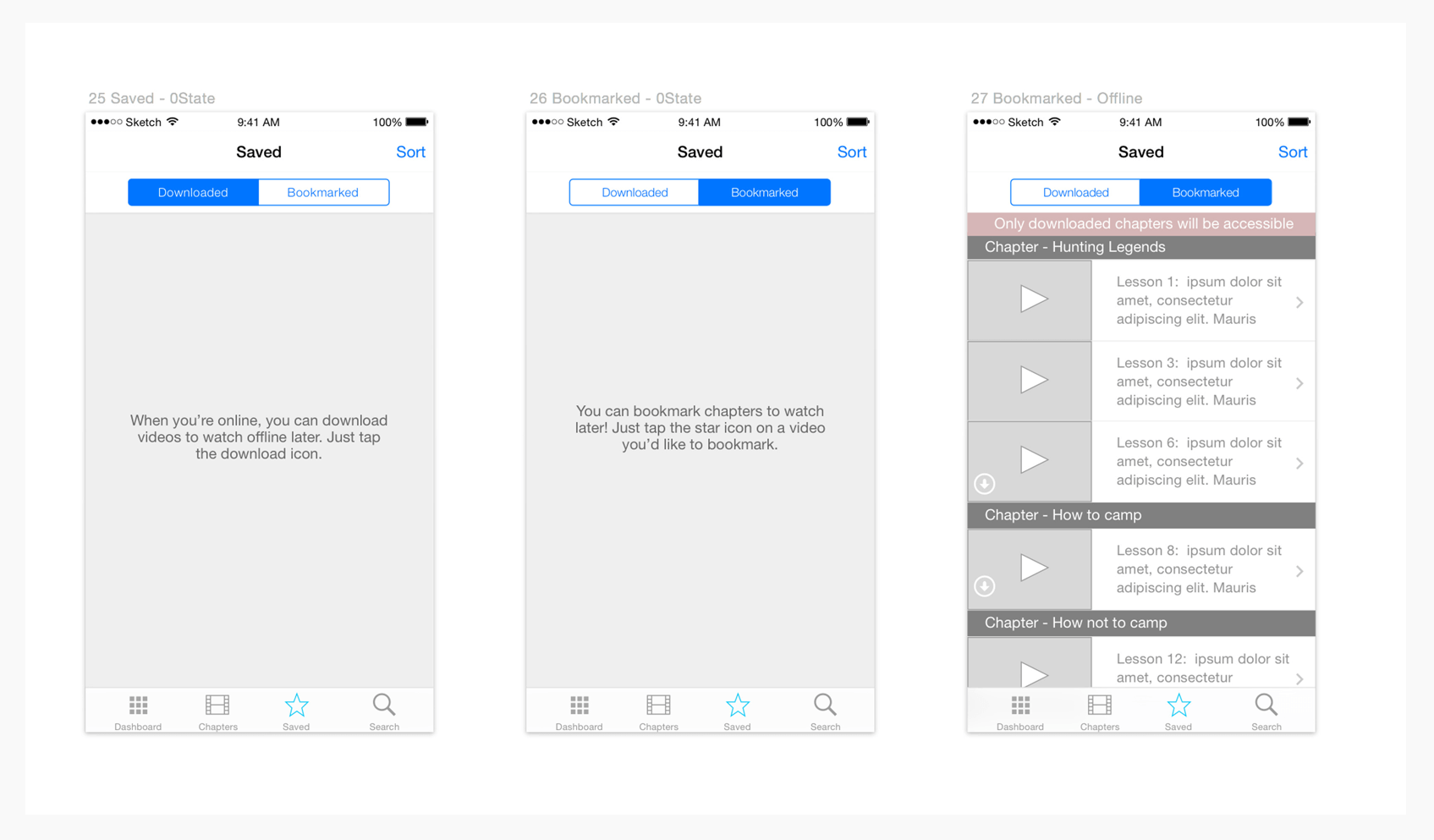
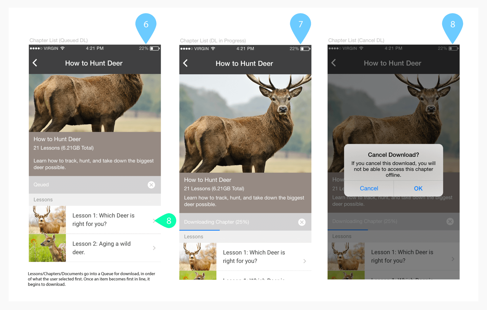
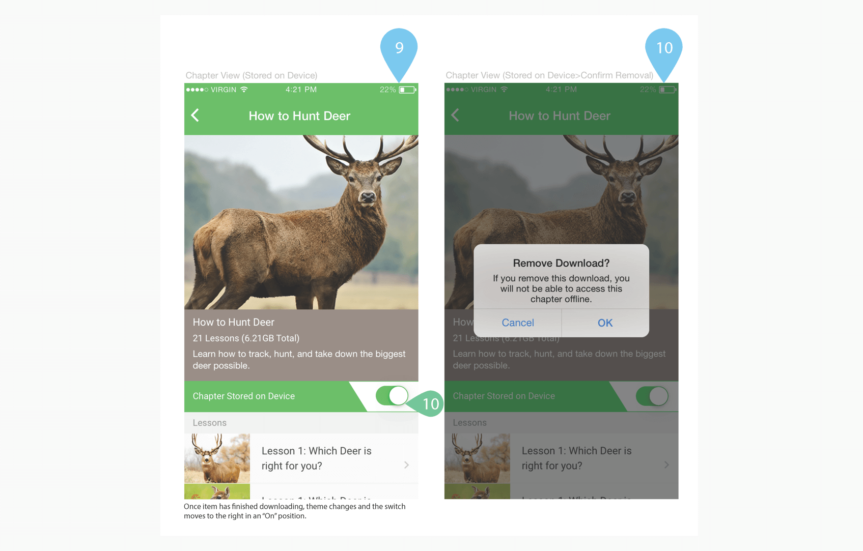
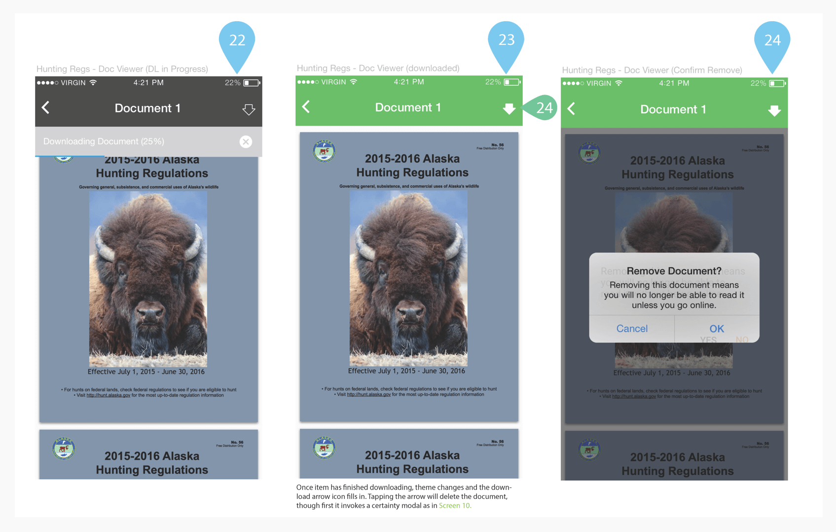
- Create a system for downloading and managing content stored on the user's device
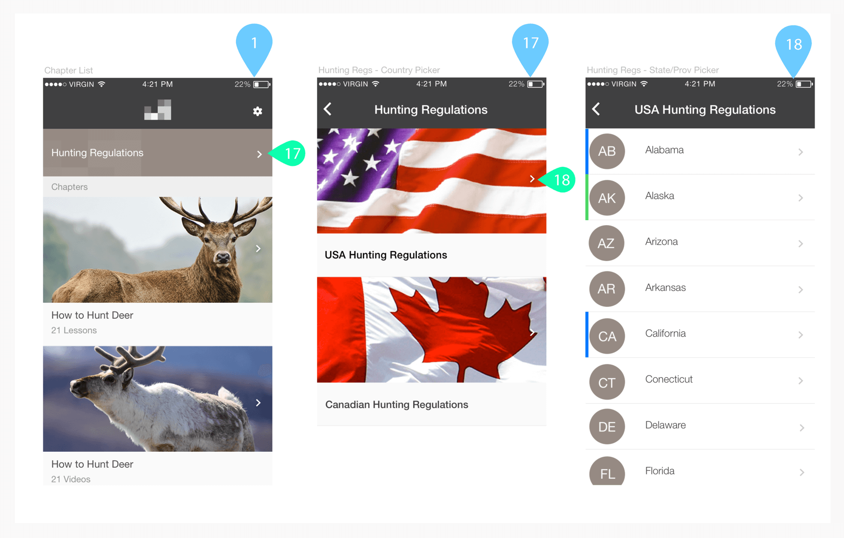
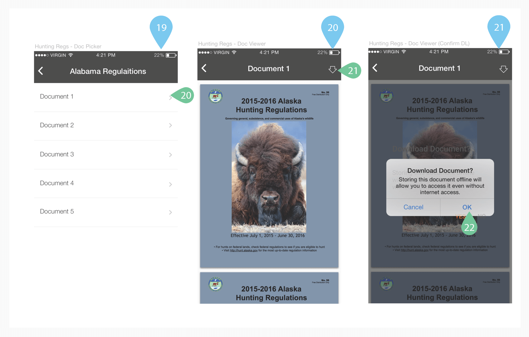
- Aggregate hunting regulation documentation from each state’s and province within the app, so users can stay up to date (this would also help create value for more experienced hunters)
- Develop a means for the client upload new content to the service at regular intervals
- Design iOS and Android versions concurrently, and work closely with the respective engineering leads to determine smooth paths to executing on the requirements
- Create a system for pushing new content to the app
- User satisfaction with the product was key
Approach
- Regularly meet with the client in order to discuss progress, features, and goals for the product
- Discussed student needs and experiences with existing lesson delivery method in order to get a sense of user needs and goals
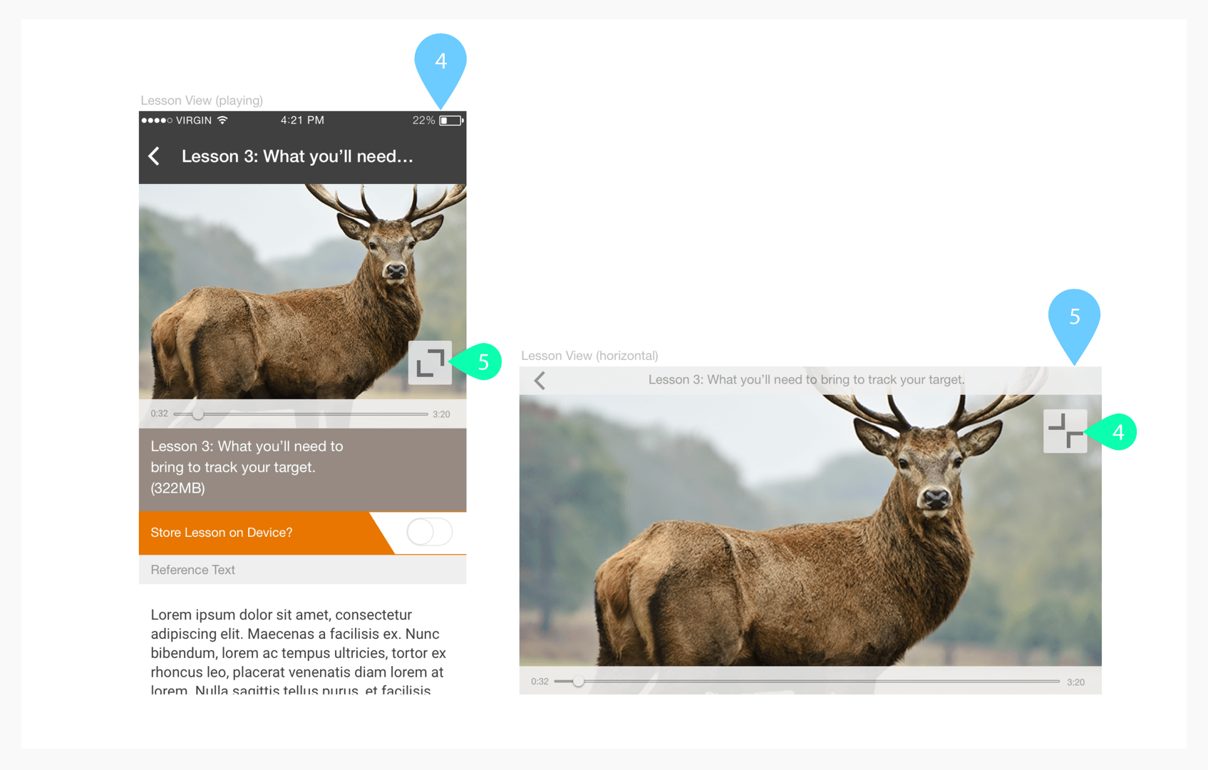
- We kept the storage limitations of devices front of mind throughout the process, so it was important to make data management very quick and easy
- Work with the client to determine course and lesson data structures. This helped the How to Hunt team organize their content in a way that worked well with the command line CMS
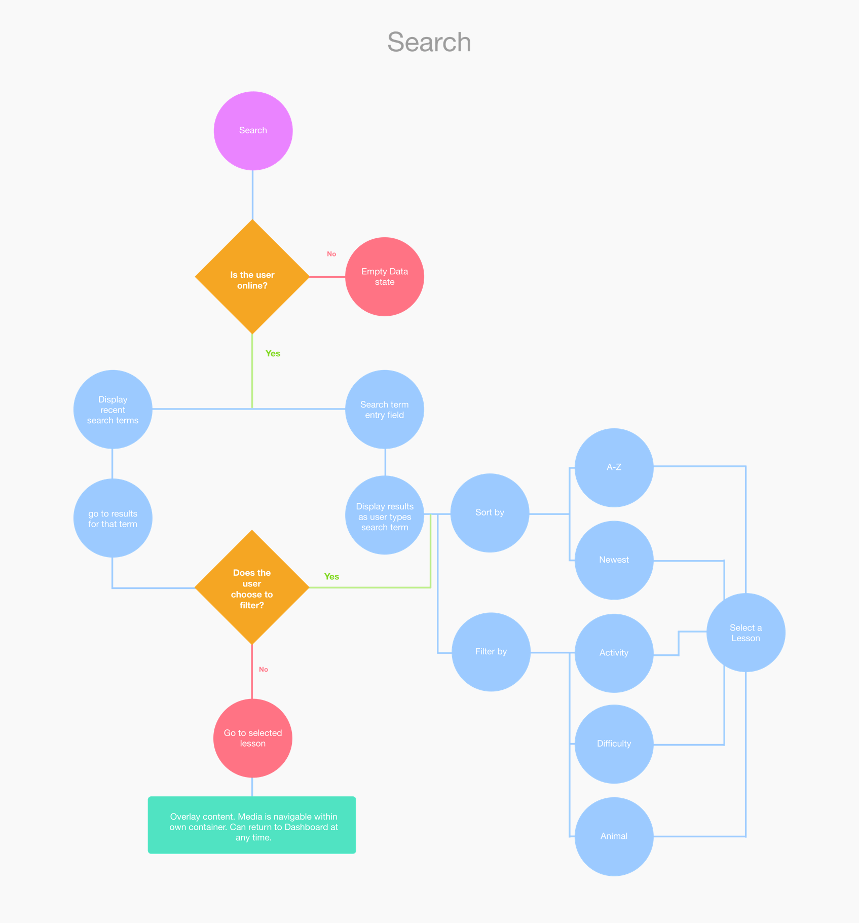
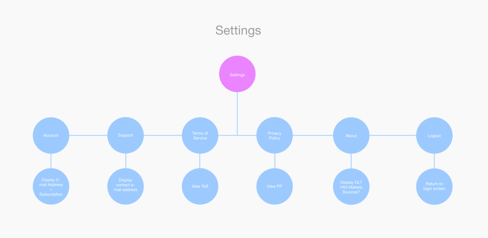
- Create an information architecture that would organize the in-app content and make it easy to discover and structure
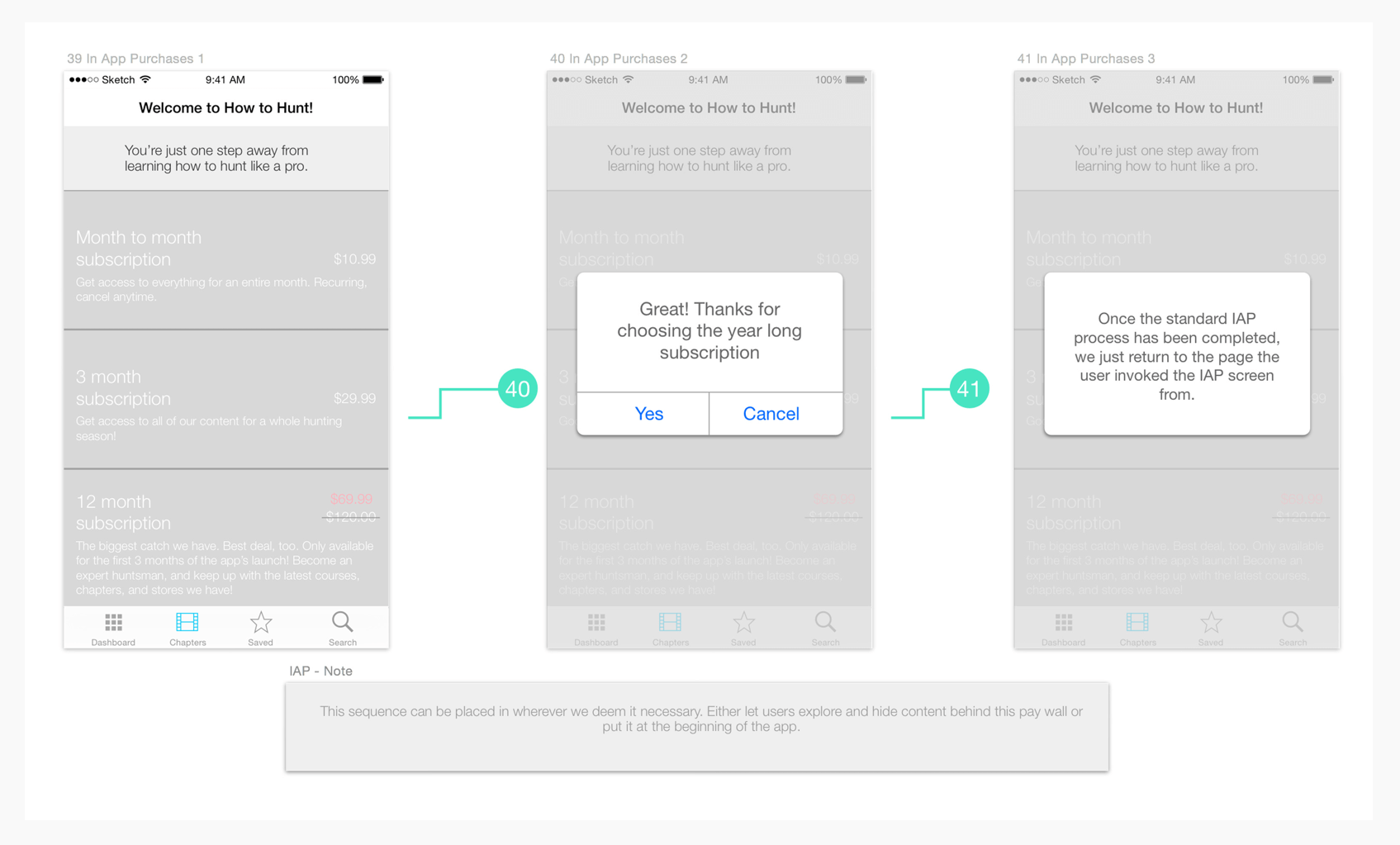
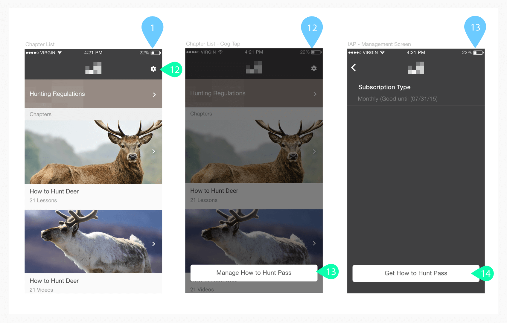
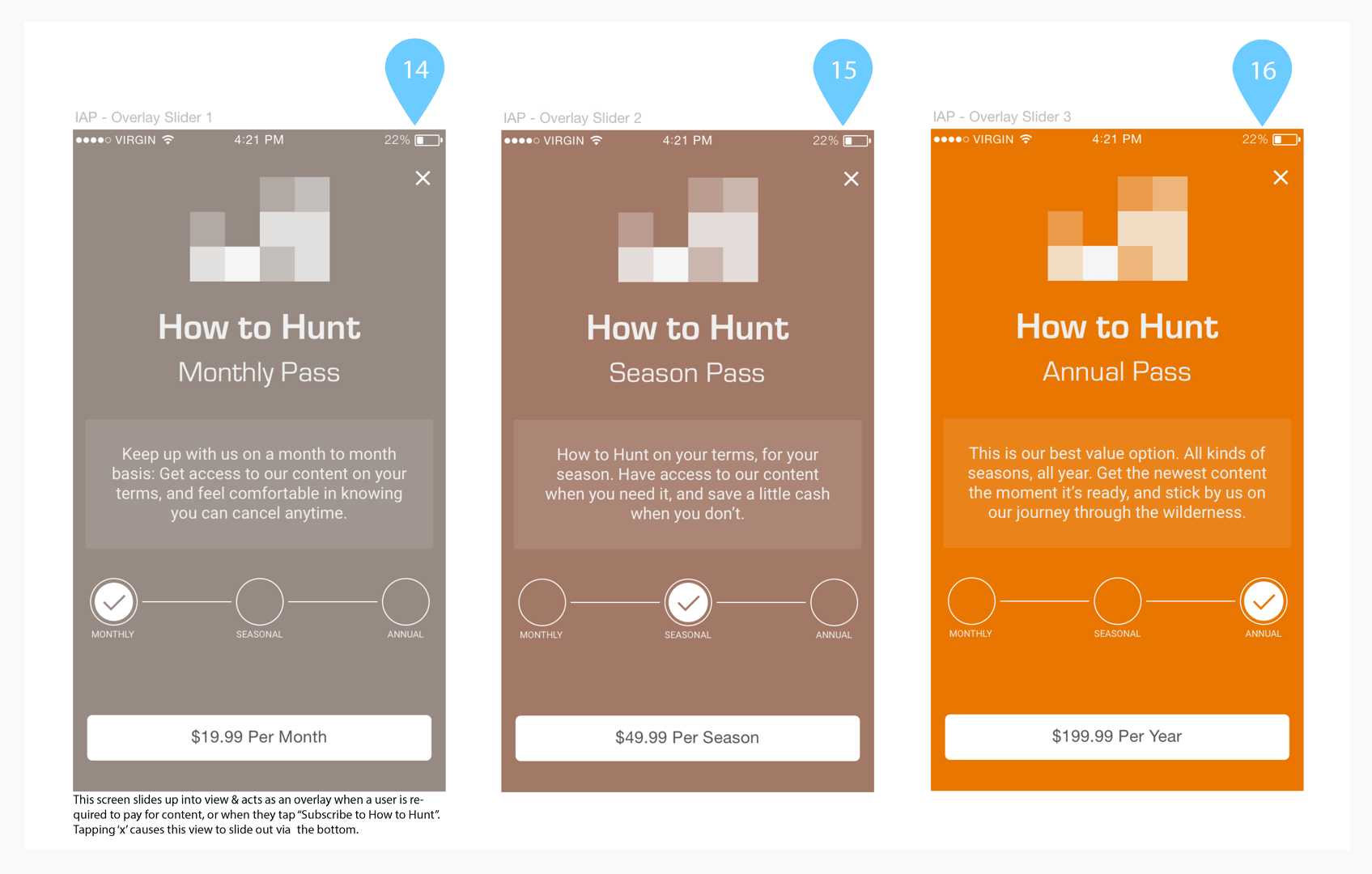
- Explore options for monetization
- Leverage as many existing iOS and Android components as possible to limit the need for custom code and expedite development time and lower engineering overhead
- Worked closely with developers throughout each step in order to ensure each aspect did not introduce engineering overhead, or operate too far outside of standard system components
- Identify future quality of life enhancements such as managing font size, a dark mode, automatically managing content
- Tested InVision prototypes with members of the team, friends and family as resources for formal user testing and analysis were not available
- Used Jira, Confluence, Zeplin, and UXPin to provide documentation to developers and quality assurance team
Outcome
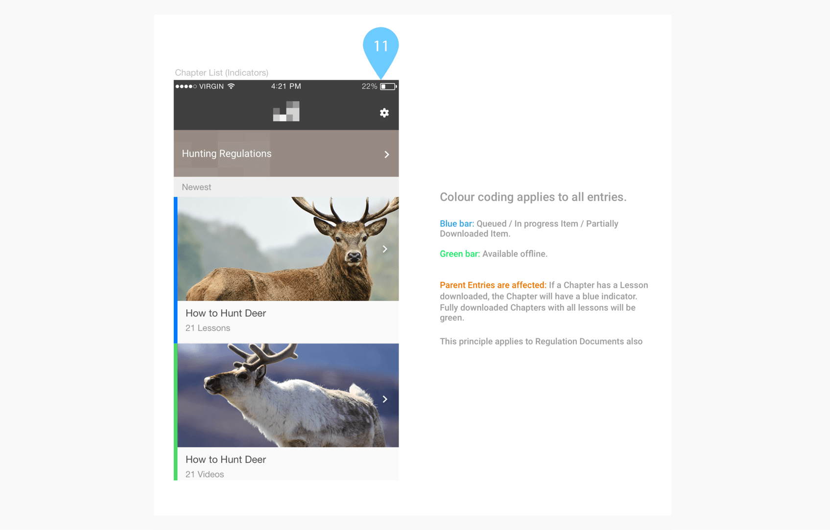
Looking back, there’s plenty of ways to enhance this product. However, if I had to choose one thing to update it would be to make the meaning of the blue/green status on the videos more clear (blue means the lesson content is queued/download in progress and green means it’s available offline).
Keeping the client looped in, up to date, and making sure I was available for feedback and conversation about the product, process, and progress helped us bring a product that he was very satisfied with.
Working closely with the iOS and Android developers made sure that each design decision was development friendly ensuring we could keep everything on track. Additionally, exclusively using standard iOS and Android components was a great design exercise and learning experience.